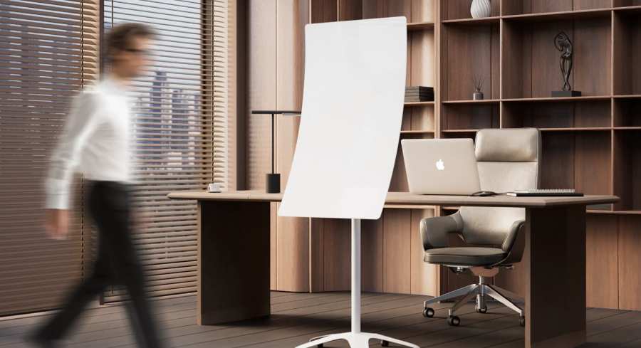
Transform how you collaborate, brainstorm, and teach with a full-surface approach.
When you look at most classrooms and meeting rooms, one thing is clear: the board is underutilized. Teachers cluster lessons in the middle. Office teams sketch quick notes in one corner. Large areas — especially the top and bottom sections — remain untouched.
This isn’t a reflection of limited ideas. It’s a design problem.
Traditional flat whiteboards create physical barriers to full-surface use. They’re uncomfortable to reach in some places and visually overwhelming in others. The result? Dead zones and wasted potential.
A curved ergonomic board, like the Human Design Board by AnatomiQ, changes everything. By aligning with the natural arc of the human body, it makes the entire surface accessible, comfortable, and engaging — transforming your board from a static tool into a dynamic collaboration canvas.
In this guide, you’ll learn how to map and maximize every inch of a curved board, unlocking its full potential for planning, collaboration, creativity, and learning.
Why Curved Boards Are a Game-Changer
1. Eliminating Dead Zones
Flat boards often force users to stretch uncomfortably or bend awkwardly to reach top and bottom areas. A curved board solves this by aligning with human arm movement, making every part of the surface accessible.
2. Encouraging Natural Collaboration
With better ergonomics, more people feel comfortable stepping up to contribute. The board becomes a shared space where everyone can engage, rather than a tool dominated by one facilitator.
3. Creating Visual Continuity
The curvature helps ideas flow across the board naturally, perfect for mapping complex strategies, timelines, or lessons without losing cohesion.
The Curved Board Usage Map: How to Divide & Conquer Your Space
To maximize your board, divide it into zones with purpose. This structured approach gives every section a role, making collaboration more effective.
1. The Center Zone: Anchor for Core Content
Purpose: This is your board’s “prime real estate.” Use it for content that needs to stay front and center.
- Classrooms: Display main lesson objectives, key concepts, or the day’s essential question.
- Offices: Use this for meeting agendas, central brainstorming themes, or high-level project goals.
Pro Tip: Use bolder colors or larger writing here to keep the central content visually dominant.
2. The Upper Arc: Reference & Context
Purpose: Reserve this area for supporting information that should remain visible throughout the session.
- Classrooms: Post vocabulary words, formulas, or instructions for ongoing activities.
- Offices: Display KPIs, reference data, overarching project timelines, or inspirational statements.
Pro Tip: Keep this section clean and uncluttered — it should provide context, not overwhelm the main workspace.
3. The Lower Arc: Interactive Engagement Zone
Purpose: This section is for others — students, teammates, or participants.
- Classrooms: Create “student spaces” for problem-solving, group exercises, or creative expression.
- Offices: Use it as an idea parking lot for team contributions, sketches, or quick sticky-note brainstorming.
Pro Tip: Encourage active participation by rotating who writes here — students solving problems, team members adding notes.
4. Side Panels: Breakout & Parallel Workspaces
Purpose: These areas are perfect for simultaneous group activities.
- Classrooms: Assign side panels to small groups for collaborative tasks, then reconvene in the center zone to review.
- Offices: Designate columns for different departments, project stages, or ideas under review.
Pro Tip: Use light grids or outlines to visually organize these sections and make collaboration more intuitive.
Pro Tips for Maximizing Your Curved Board
- Color-Code Zones: Assign distinct colors to different areas (e.g., green for student input, blue for key points, red for deadlines).
- Incorporate Magnetic Accessories: Add charts, diagrams, or modular templates to hybridize physical and digital workflows.
- Archive Before Erasing: Take photos of sessions or use companion apps to save your work digitally.
- Set Rules for Participation: Clearly communicate how each zone will be used to avoid clutter or overlapping content.
- Revisit the Map Regularly: Adjust the setup based on team or classroom feedback to ensure it stays effective.
Use Cases: How to Bring Your Usage Map to Life
In Classrooms:
- Interactive Problem-Solving: Let students work in teams using side panels while the main lesson remains visible in the center.
- Layered Lessons: Post supporting material up top while walking through step-by-step processes in the center.
- Student Ownership: Give students a dedicated “collaboration space” in the lower arc to make them active contributors.
In Offices:
- Agile Project Planning: Map sprint tasks along the side panels, keep priorities in the center, and log backlog items at the bottom.
- Design Thinking Sessions: Use upper zones for research insights, center for ideation, and lower arcs for sketching or rapid prototyping.
- Cross-Functional Workshops: Assign sections to different teams or departments for live collaboration.
How the Human Design Board Enables This Approach
The Human Design Board by AnatomiQ was built specifically for ergonomic full-surface use:
- Patented curved design: No more unreachable zones or awkward stretching.
- Human-centered ergonomics: Supports natural movement for long, comfortable sessions.
- Award-winning innovation: Recognized for transforming how classrooms and offices collaborate.
Whether you’re teaching a class of 30 or leading a multi-team brainstorming session, the Human Design Board makes every inch of your workspace usable, comfortable, and visually organized.
Example Layouts for Your Usage Map
Classroom Setup Example:
- Center Zone: Main lesson content and objectives.
- Upper Arc: Vocabulary, formulas, or rubrics.
- Lower Arc: Student activity zone for quick answers or creative exercises.
- Side Panels: Breakout group collaboration spaces.
Office Setup Example:
- Center Zone: Meeting agenda or core strategy themes.
- Upper Arc: Company KPIs, key research data, or inspirational goals.
- Lower Arc: Idea capture area for group brainstorming.
- Side Panels: Project stages, departmental inputs, or task ownership columns.
Conclusion: From Wasted Space to a Collaboration Powerhouse
A whiteboard isn’t just a wall accessory — it’s a collaboration engine. But only if it’s designed and used properly.
By adopting a curved ergonomic board and implementing a thoughtful usage map, you can:
- Unlock every inch of the surface for meaningful work.
- Increase engagement among students, teammates, or participants.
- Organize complex ideas visually for better outcomes.
Ready to make your board work as hard as you do?
Explore the Human Design Board at AnatomiQBoard.com and see how it transforms classrooms and offices alike.


